mensa
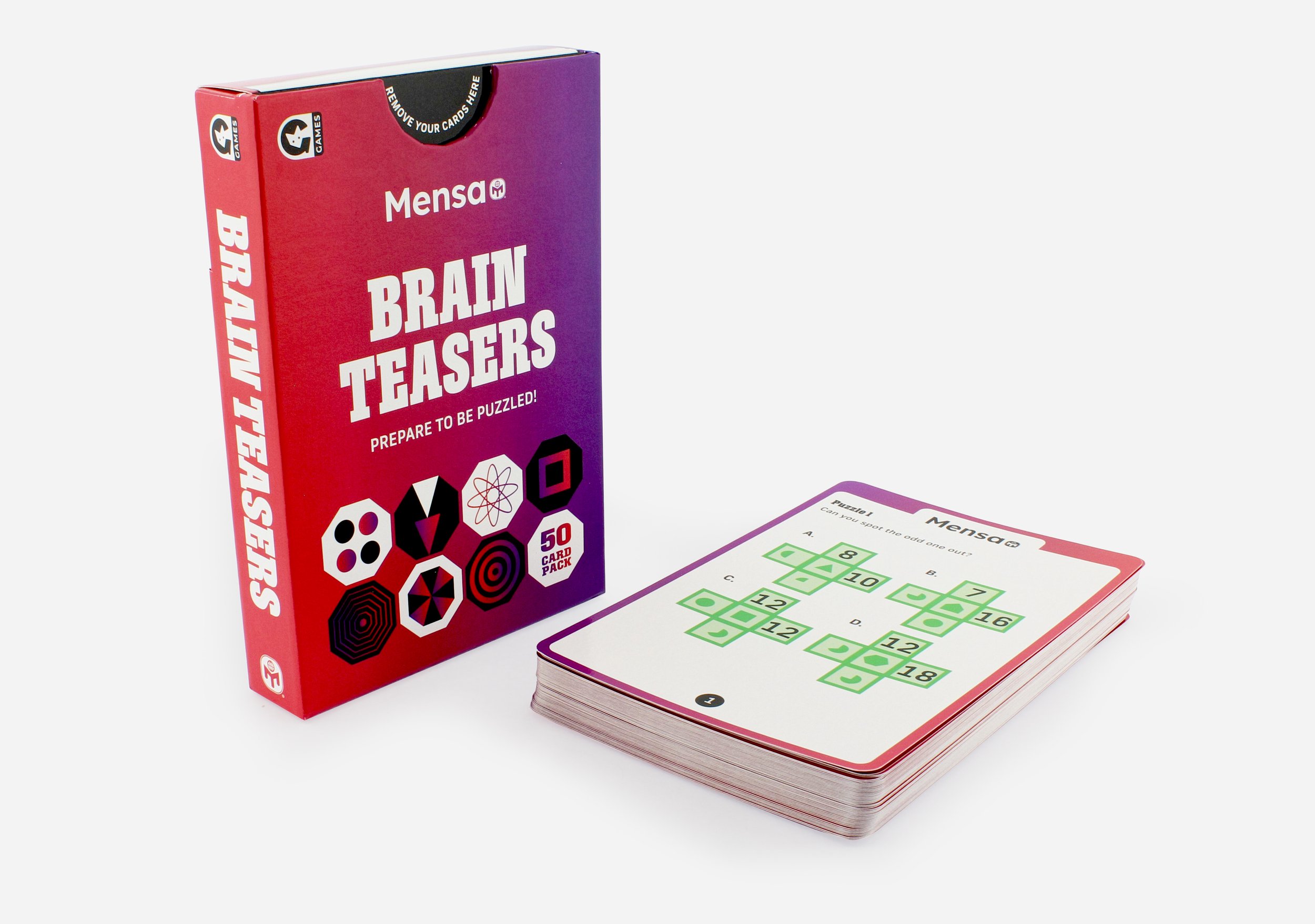
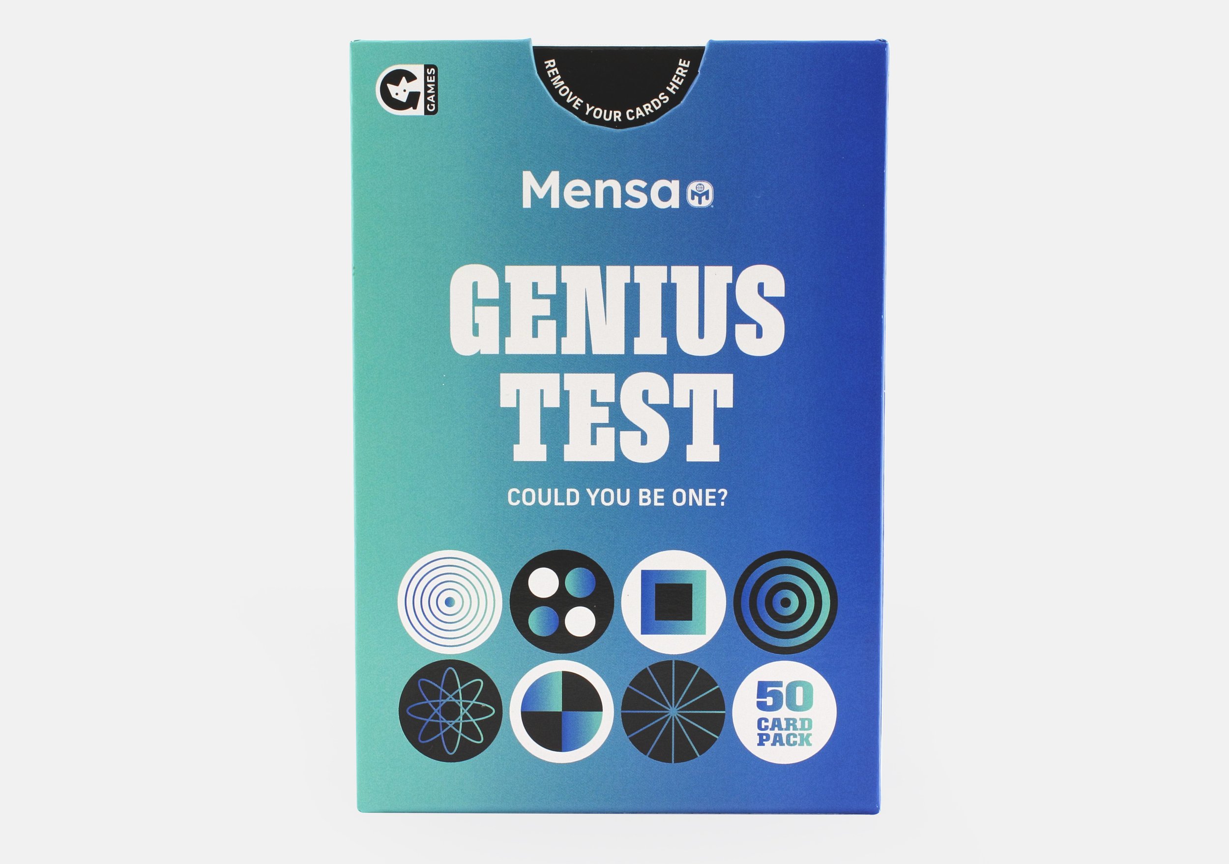
Though these are licensed titles, Mensa do not have strict brand guidelines or requirements, so I was able to have creative freedom, however, I still wanted to have a nod to the books which I did by using the same typeface they had used for the book titles. The previous designs for this range felt “school” like and had a more educational approach, whilst for these versions, I was briefed to create a more giftable look. I achieved this by using bright gradients in contrast with black and white, combined with icons that have a nod to mathematics and problem solving, and therefore still maintaining an educational element.
Packaging and cards layout designed by me. Content and puzzles supplied by Mensa. Cards artworked by another member of the team at Ginger Fox.