SATCH'S SNACKS
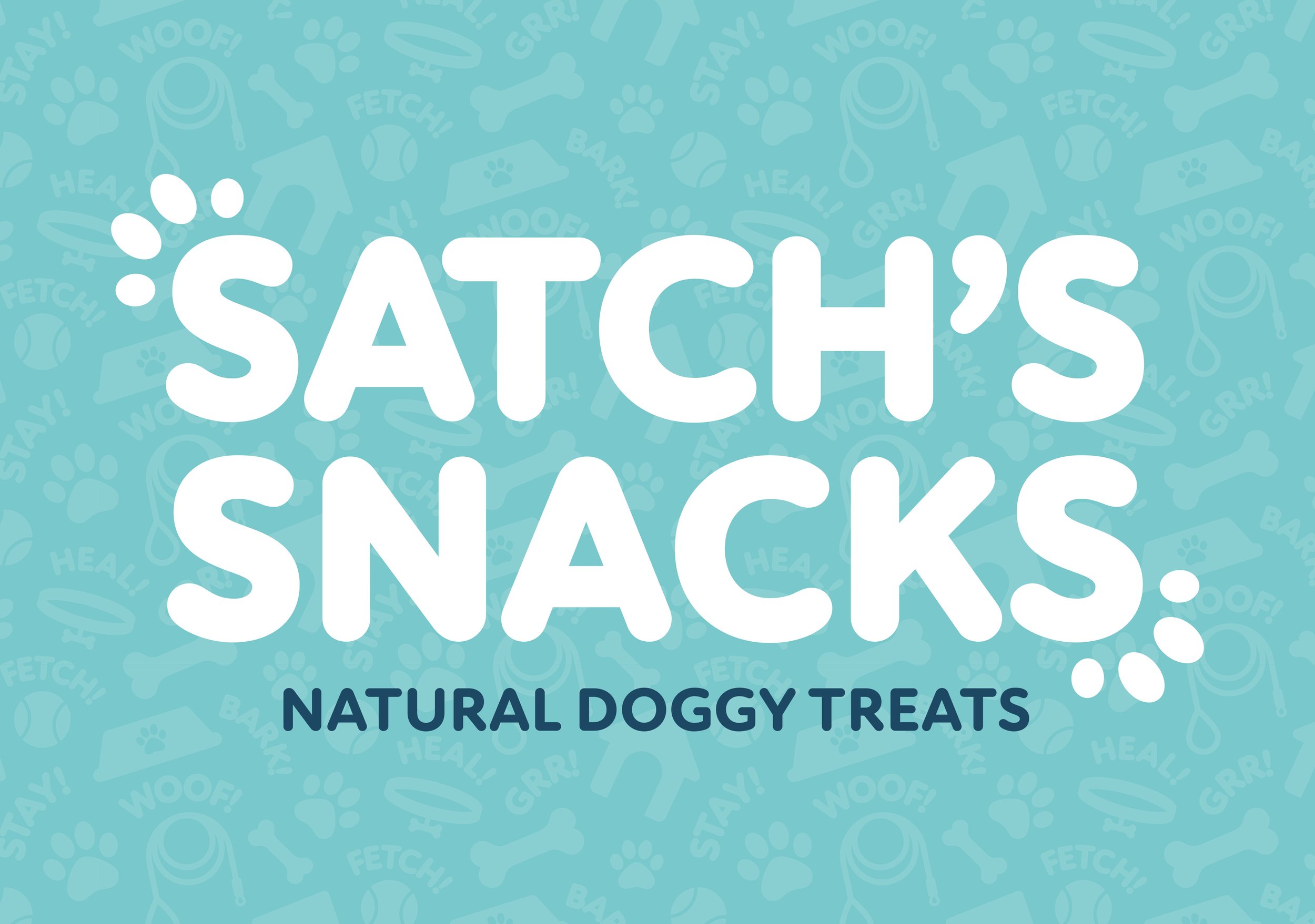
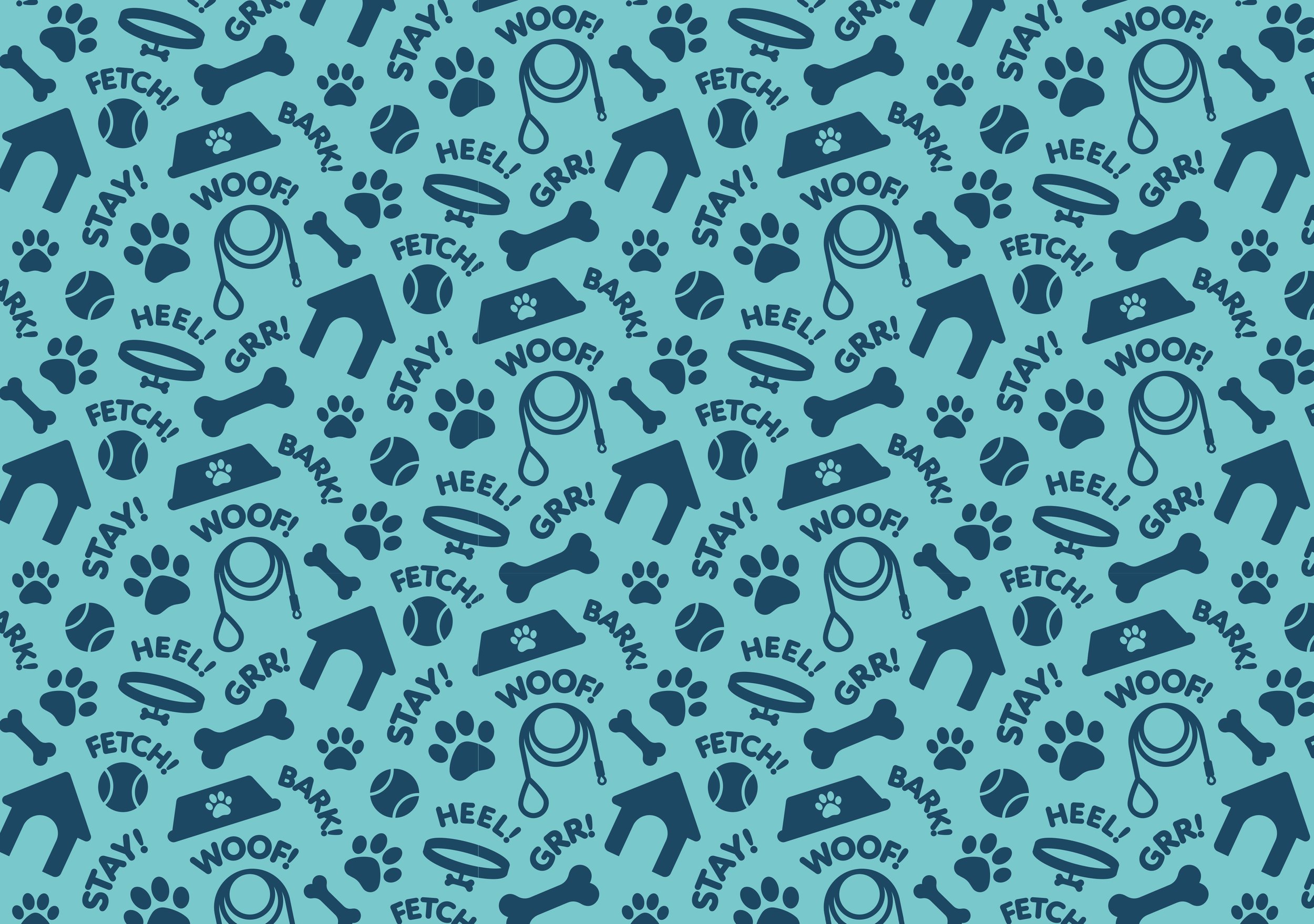
A friend of mine asked me to recreate their natural dog treats company logo, on a small budget, which they had originally made themselves. They didn’t want me to stray too far from the original logo and wanted to keep the dark and light blue colour palette, so I decided to do some little tweaks to help the logo feel friendlier and more playful, to capture the “natural” selling point of the brand. I did this by using warmer tones of the blues and softened the typography, with the addition of little “toe beans” on the first and last “S” to give the illusion of paw prints. My friend was also looking to get printed tissue paper to go into the dog treats boxes, so I designed a repeating dog themed pattern they could be used across different aspects of their brand, as well a secondary version of the logo which could be used on stickers to seal the bags and boxes.